Tuesday, July 24, 2012

Lorenz Curve

Lorenz Curve shows the difference between equality inequality.  It is talking about economics and how it affects population and income.  


l

Graduated Symbol Map

Graduated symbol maps are used with circles, triangles, and squares to show symbols.  These maps show the motor vehicle deaths in Florida and where most of the deaths took place.  There is a high death rate in the western part of Florida.  


Box Plot


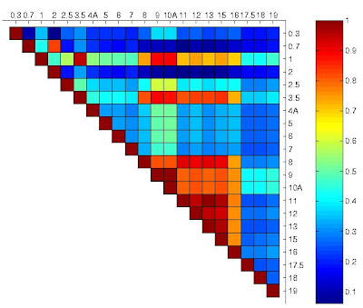
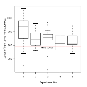
Above is a box plot of an experiment that involves the true speed of light.  Box plots, also know as box and whisker plots displays the statistical data of the lower quartile, median, upper quartile, and outliers.  This map allow for conclusions to be made based upon researched data.


3D Map

3D mapping is used a ton today.  Using 3D occurs in movie theaters and GPS systems.  GPS systems are unique because it shows building and roads in 3D.  


Similarity Matrix


A similarity matrix is used to connect two similar data points.  This similarity matrix connects corrolated behavior between proteins.


Similarity Matrix

DLG map

DLG stand for digital line graph.  It is a cartographic map that displays map vectors.  In this map it display where water is located in specific places.  


Isopach


This isopach map above uses a colored map key and contour lines to express the thickness of an area. Isopach maps such as these can be used to when dealing with geographic drilling and structural building.

DRG Map

 
This map is the DRG map.  The lines display the different water routes.  The line draws in between the 2 counties.  DRG stand for Digital Raster Graphics.  The map is basically a scanned image. 


Isohyets


Isohyet maps are used to express the amount of rainfall in a certain time range.  The map above is an isohyet map of Hong Kong which uses connecting contour lines and values to group together equal values.


Isotachs


This isotach map branches over Kansas, Nebraska, and Iowa.  Isotach maps are used in meteorology to express wind speeds of an area.  These maps like isobar maps also have connecting lines at points of equal speeds.

Isobars


An isobar map is used for plotting weather data.  This map uses connecting lines at equal points on the map that represent pressure.  The map shows the high and low levels.

Soil Map

  
Soil maps are used for gardeners with huge fields.  They have to keep up with the different types of soils and textures.  Without this map, the gardener can have different types of soils in places and it could mess up the fields.

Bar Graph Map

Bar graphs are used for a huge bundle of things.  Bar graphs are used to determine how much money is coming to a company each year and this graph displays 4th quarter regional revenue.  


LIDAR

Lidar SOA Image

LIDAR (Light Detection And Ranging) is a technology that uses satellites for mapping.  The above map is a LIDAR map depicts the city using laser technology.

LIDAR Link

Trail Map

Trail maps are mainly for hikers and campers.  These maps display routes in the woods mainly and how many miles it takes to get there.  This map displays where the hotel is located and different counties.  


Hazard Map

Hazard maps displays the dangerous hazards that are located in specific areas.  It can be earthquakes, tornadoes, hailstorms, or anything very dangerous.  These maps can help prevent deaths and injuries from happening.  


Doppler Radar


Doppler radar images are captured using the doppler effect to predict weather.  Doppler images are used primarily by news broadcasters.  The doppler map above is an image of Hurricane Katrina and its projected  movement during the time of the storm.

Doppler Radar Link

Black and White Aerial Photo


This black and white aerial photo of the interchange near Baltimore shows images from 20,000 feet in the air in 1998.  These images can be taken from high and/or low altitude and either high or medium resolution which allows for an elevated picture to be taken.Black and white film allow for images of structural features and land area.

Infrared Aerial Photo


This is an infrared aerial photo of the Bull Creek Wildlife Management Area in Osceola County, Florida. These aerial photos are taken using medium or high resolution digital images to capture photos of the land.

Infrared Aerial Photo Link 

Isochrone Map

 
This map displays the times people drive around the airport.  This lets you know when to travel and when should bus transportations come and go so it will not be crowded.  The location is northern Finland.  


Cartographic Animation


This is a cartographic animation of Mt. Saint Helens after a volcano eruption in 1979. Cartographic animations use 3-D elements to produce a visual description of the environment.  This map also uses contour lines to help express its statement.

Meteorological Map

 
Meteorological maps display the weather that is going on in a certain area.  Here you have a tropical storm in the water and it is making its way on land.  It displays the day and the time that the storm is approaching land.  


Statistical Map


This statistical map above shows the International Connectivity of all of the continents in the world.  Statistical maps.  Statistical maps represent different quantitative data geographically with the help of a specified map key.  This map shows that most of the world has internet access and there are very few places that have only email or no connectivity at all.

Cartograms


Map 1


Map 2

This is a cartogram of the world.  As shown this map shows a distorted perception of the map displaying statistical data showing the earth's population (Map 1) and the Gross domestic product (Map 2).


Transit Map

Transit maps helps people get a better knowledge about galaxy's and the different types of networks there are.  


Travel Map

 
This map is of Georgia.  This map displays the major highways in Georgia.  It is color coded to represent which part of Georgia is what.  This map displays the major cities.


Flow Map


This is a flow map of How to Make a Peanut Butter Sandwhich that is used to show movement which in this case is movement from step to step.  Flow maps can be used geographically to show migration of people from one country to another or how goods are shipped between places.

Political Maps

Political maps are displayed to show the countries in the world.  The countries are in different colors to represent their nation.  Political maps show the capital of countries and the important cities located in the country.  


Climate Map

 
A climate map illustrates the annual weather temperature.  The weather is measured in Celsius and Fahrenheit.  The map shows that it is hottest in Africa and that is where most of the deserts in the world are.  The coldest climates are up north.  

Isoline Maps


Isoline maps like this gasoline field map use valued points connected by a continuous line to show data.  The contour lines used in isoline maps are used to connect the equal values.

Stem and Leaf Plot Map


Stem and leaf plot maps are displayed to show who scored the most in a certain area.  In  this map, people scored in the 70s and 80s.  There was one 53 and the highest was 94.  


Star Plot Map

  
This star plot made was invented by Nasa.  The red line is the MER IDD and is used to compare each of the designs.  


Proportional Circle Map


In a proportional circle map such as the one above the circles represent a predetermined value which is then expressed by the placement and size of the circle in its specific location on the map.  These maps are used to express statically data geographically.  This map shows the amounts of Walmarts in the United States in 2009.  The map shows that Walmarts are more prevalent on the east coast.

Choropleth Map


Choropleth maps are used to express data of certain areas by using a color system.  This map shows the different percentages of people in Florida who are Hispanic or Latino (of any race) by County.  Each color in the map key represents an equal range of data expressed.

Dot Distribution Map


This is a dot distribution map of the United States in 2000 that show the Hispanic population of the country.    Dot distribution maps are used to express patterns and use each dot to show a particular number of quantitative information.  In this map each dot represents 10,000 people.  Dot distribution maps are most useful to express information about population or other statistical data.

Propaganda Map


This is a propaganda map poster of Florida.  Propaganda maps are used to incite individuals or sway their perspective of a certain region or area.  This map of Florida is being used to draw people into the state and get them to want to visit.  With mini pictures of the attractions from all over the state and the woman in a bathing suit at the bottom of this map that is how they plan to achieve their goal.


Histogram map

  
The histogram map shows the percentage of people with a university degree who dwell about things involving money.  The graph on the right shows the people who dwell about a university degree.  


Hypsometric Map


Hypsometric maps use colors and contouring lines to mark elevation of the area.  The different colors represent the different elevation levels expressed.  This map of France shows that higher levels of elevation towards the middle of the map and lower elevation levels in  the darker regions of the map.

DEM map

  
The DEM map illustrates the earth in a globe form.  It has all of the countries and regions.  With this map, you can measure the distance between one location to another location.  This map is used to find particular areas you are unsure of the location. 


PLSS Map


PLSS maps or Public Land Survey System maps are used to divide land for purposes of land ownership and townships.  PLSS map land divisions are broken down into rectangular areas as shown above in the PLSS map of Alabama.  These maps can either be systematic or unsystematic for land partioning with initial points and base lines marked.

PLSS Map Link

DOQQ map

 
This map shows the floodplains of Texas.  The red and yellow lines illustrate the county roads and city streets.  The lines are basically drawn to match what the city looks like and it shows where the water is.

Cadastral Map


This cadastral map of Costa Rica marks the property and real estate lines of the area. Cadastral maps are primarily used to mark ownership of land.  This map uses the color dark green, light red, and dark red to mark the land boundaries of Costa Rica.

Windrose map

The windrose map shows how fast wind is.  It shows the wind speed and the direction the wind is blowing.  Weather meteorologists use this map to predict the forecast.  


Bilateral Map

 
This map is called a bilateral map.  It shows part of the world.  The lines in the maps are connected from continent to continent and country to country.  The lines show air service agreements between world trade member organizations.  These maps are used so show where airlines travel.  When flying on airplanes, in the seat pocket there is a book and in the back of the book, it shows where their specific airlines travel.  


Thematic Map


Thematic maps can be used to display information of both large and small areas.  This is a thematic map of generalized soil patterns of South Africa in 2003.  The different colors represent the patterns of the specific feature being exhibited.  Thematic maps can show features of particular areas varying from social and economic features to agriculture and demographic features.  This map shows a larger density of soil resources in lower South Africa.

Topographic Map


Topographic maps are very detailed and require a variety of line use and color to properly express both natural and man-made features of an area.  Because topographic maps express the elevation of an area contouring and an assortment of line segments are used.  As shown in this topographic map of New York and in other topographic maps two-dimensional features are able to be shown on a map.  This map of New York uses a color key to shown features. i.e. Blue = water, Green = foilage, Black square = building, etc.

Population Profile Map

This population profile map shows the percent change in resident population for the 50 states in the United States and that includes the District of Columbia and Puerto Rico.  The time frame is from 1990-2000.  The map shows that more people move to Nevada than any other state.  I see why because of the tourist attractions and the bright lights.  The lowest on this map shows its in DC.  


Planimetric Map


This is a planimetric map of San Antonio.  It displays the view of an area based upon natural features and uses exact coordinates to display the correct positions of buildings, roads, and other scenery.  Planimetric maps like this one capture these details with a variety of horizontal lines and features.  This map shows buildings and streets of the San Antonio area,

                                                 Planimetric Map Link 

Classed Choropleth Map

In this choropleth map, it displays the ratio of men to women throughout the United States.  A choropleth map is a map where areas are shaded in proportion of statistic of measurements.  The map shows that in some states there are more women in some states than there are men.  In some states, it shows that there are more men than there are women.